Waterloo Package Design
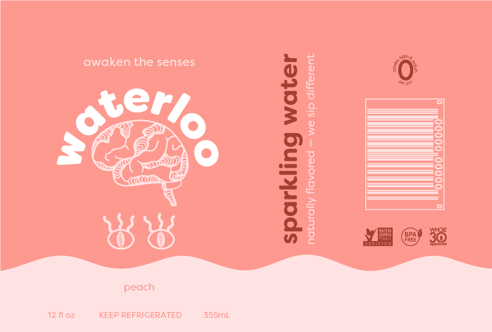
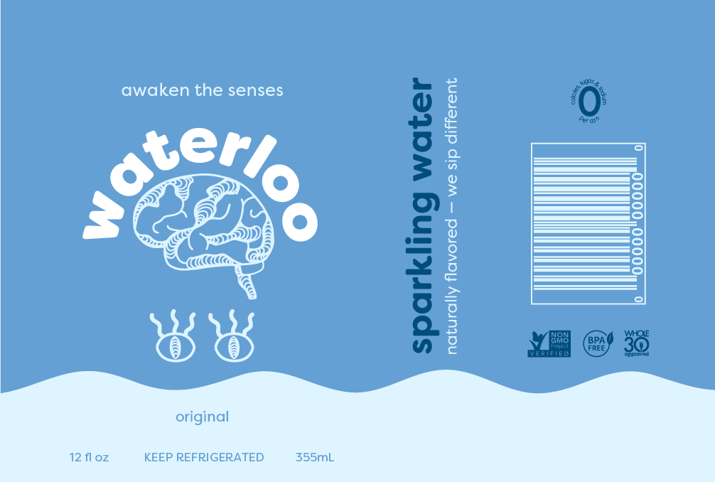
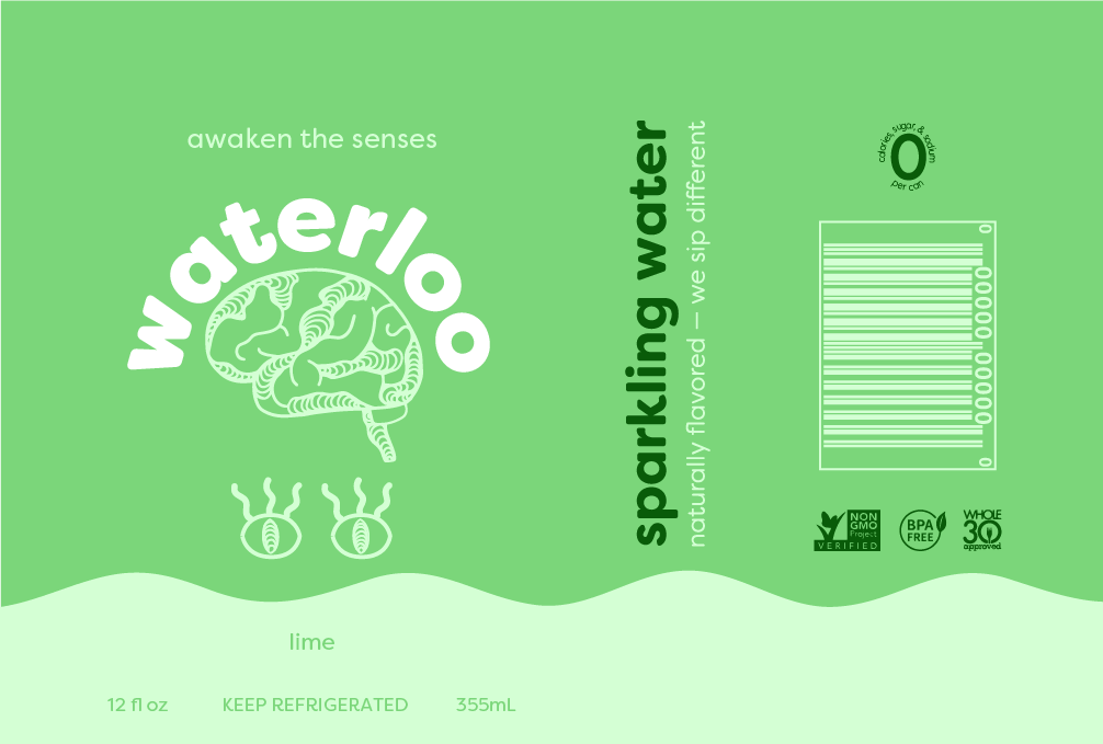
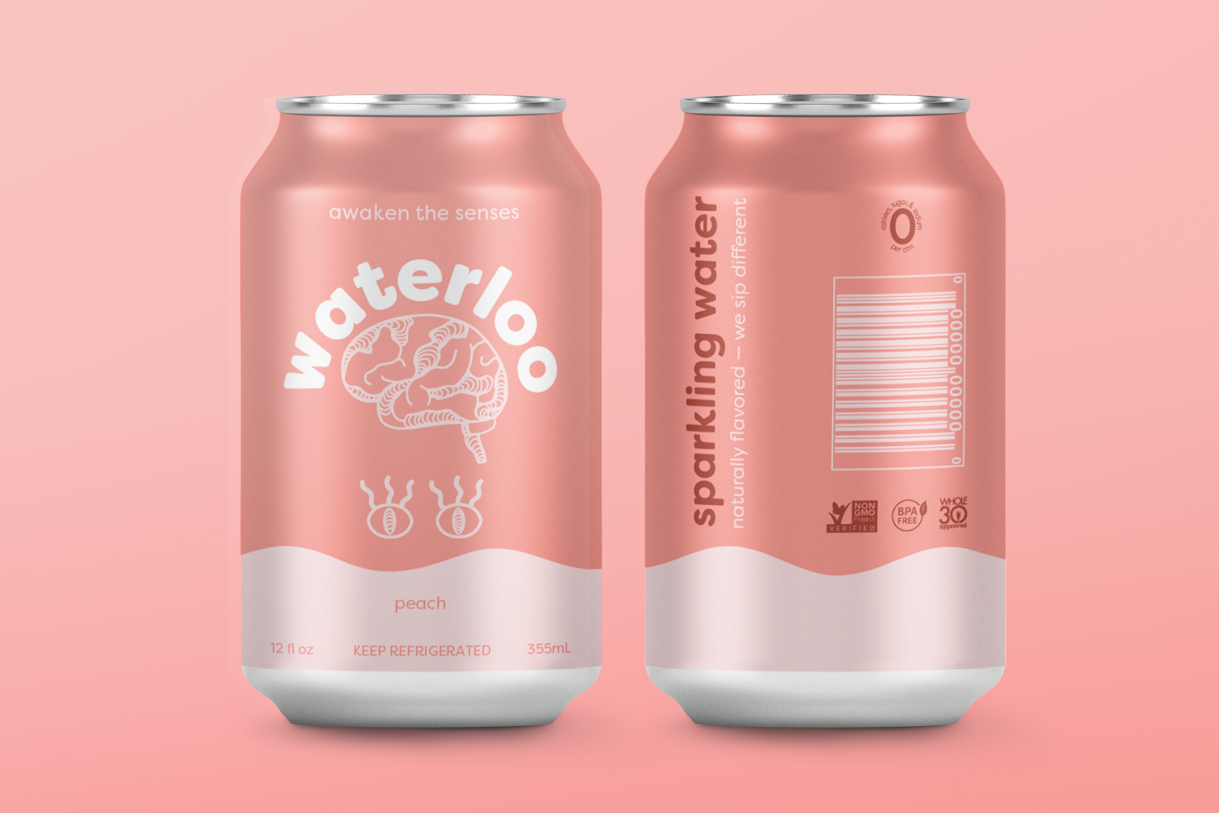
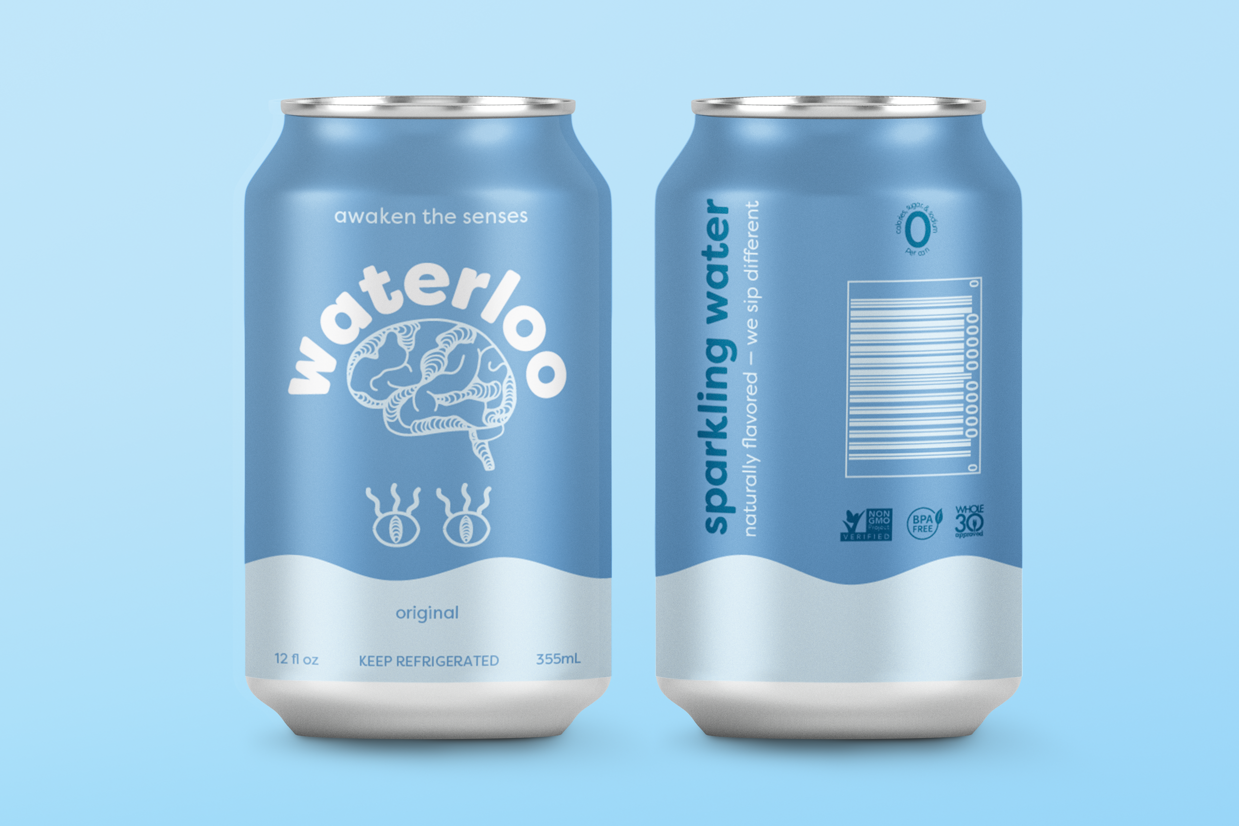
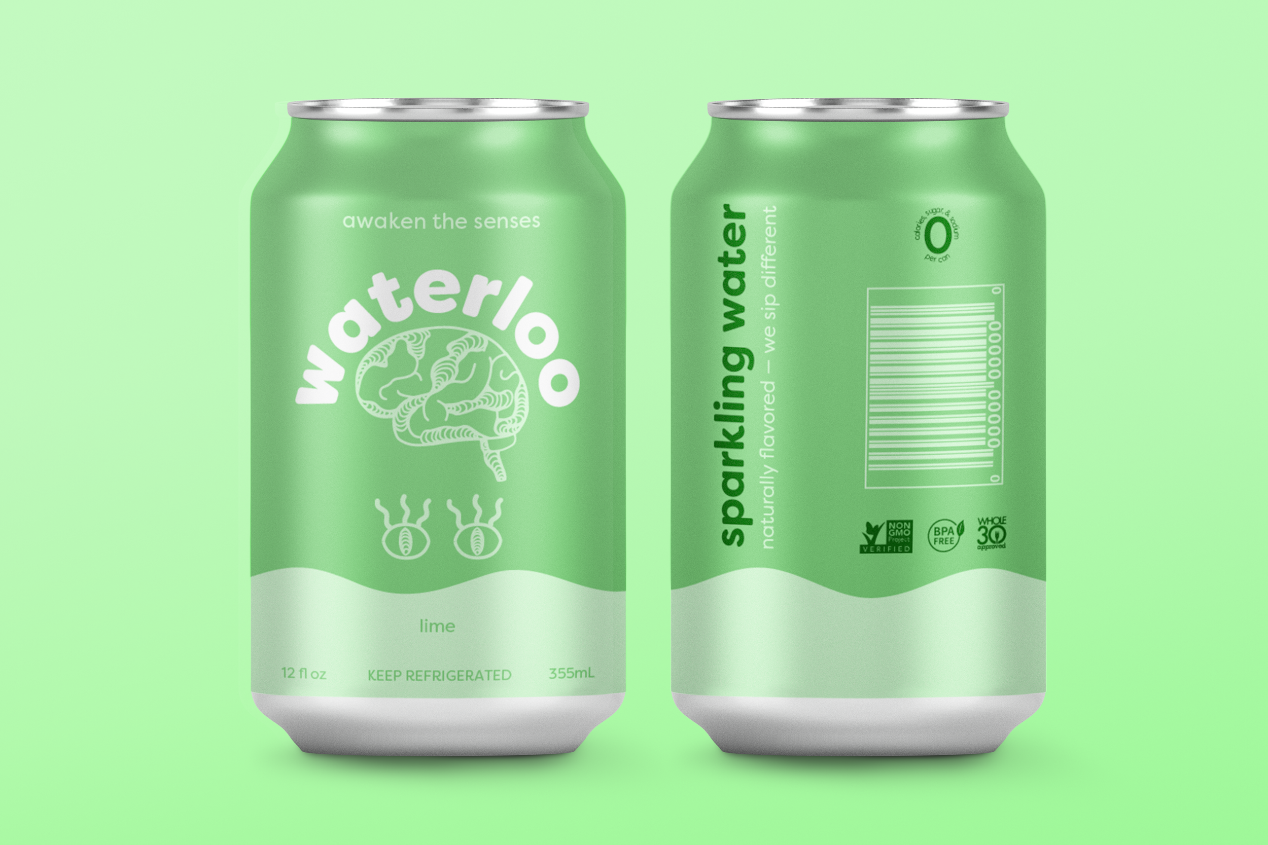
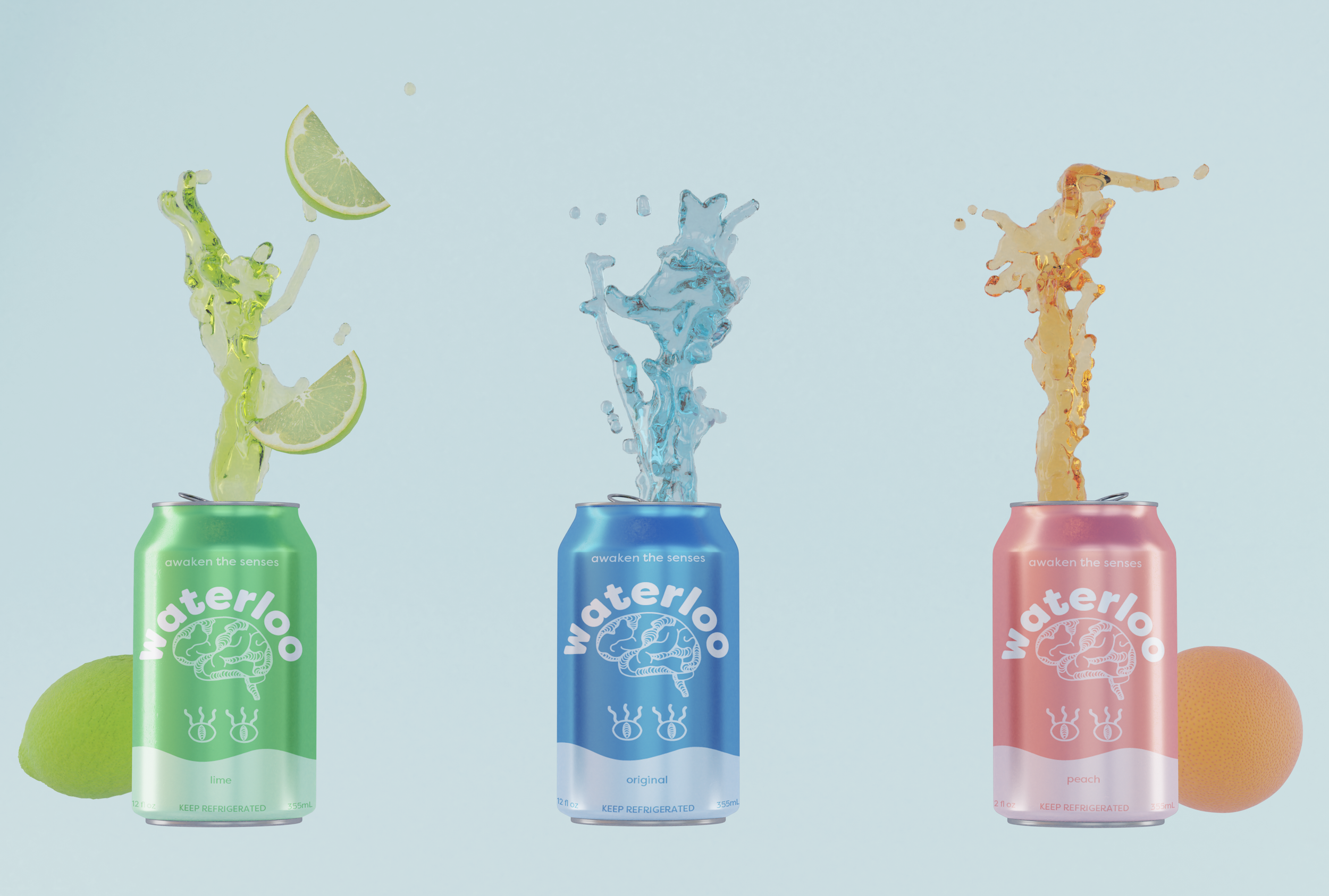
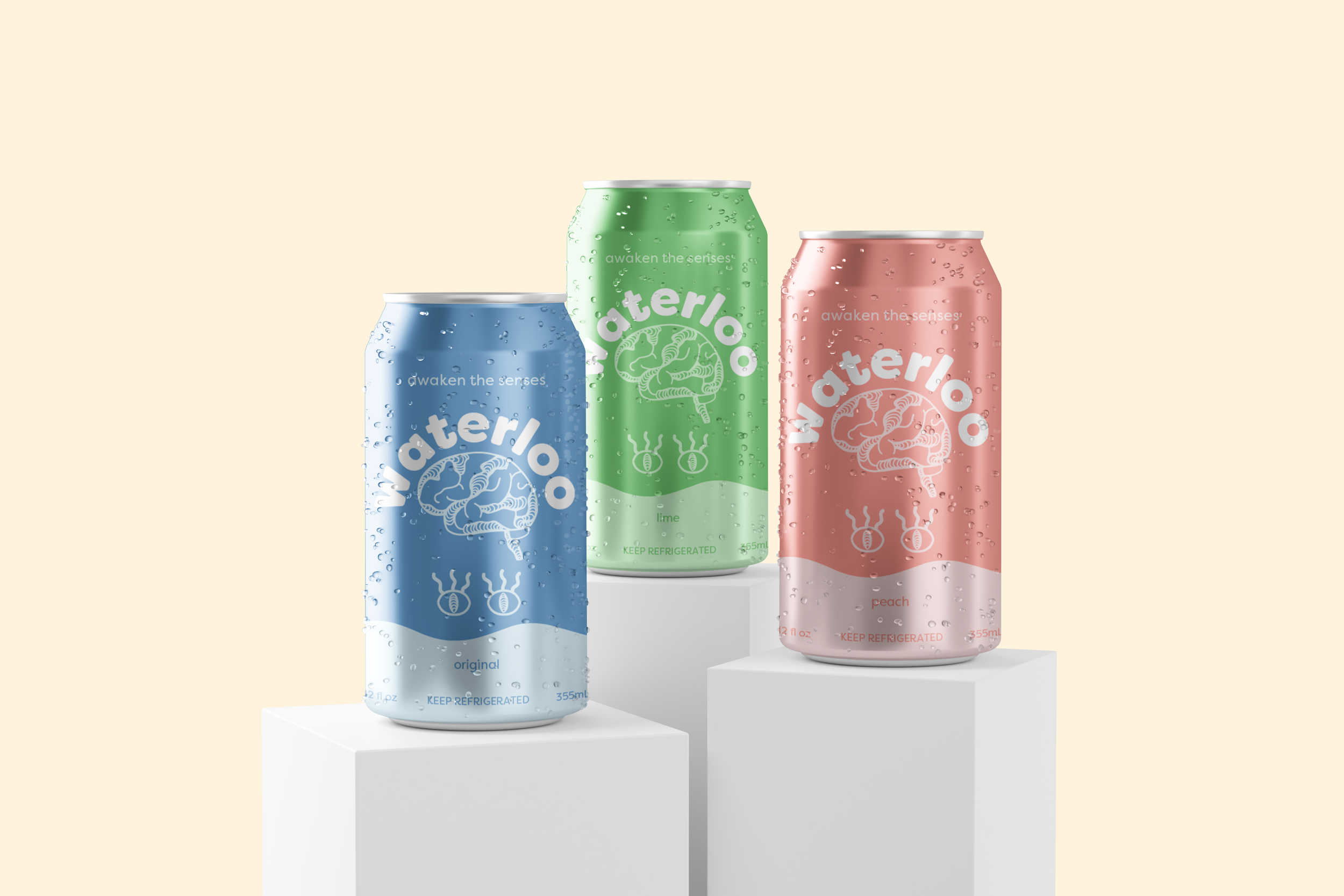
Refresh of Waterloo Sparkling Water with a newly created logo and can design.
DESCRIPTION
This project aimed to improve the visual branding of Waterloo Sparkling Water by redesigning the logo and refining the package design. I conducted a detailed analysis of the existing packaging, identifying areas for improvement. The goal was to create a design that not only appealed to the target audience but also effectively conveyed the essence of the Waterloo brand, ensuring a cohesive and eye-catching visual experience.
GOALS
Redesign the can’s logo and elements to create a visually striking, modern look that resonates with consumers and stands out on store shelves
Design packaging that not only captures the brand’s mission but also encourages customer loyalty
Create a clean, appealing layout that is visually less cluttered and easier to read than the current design
PROCESS
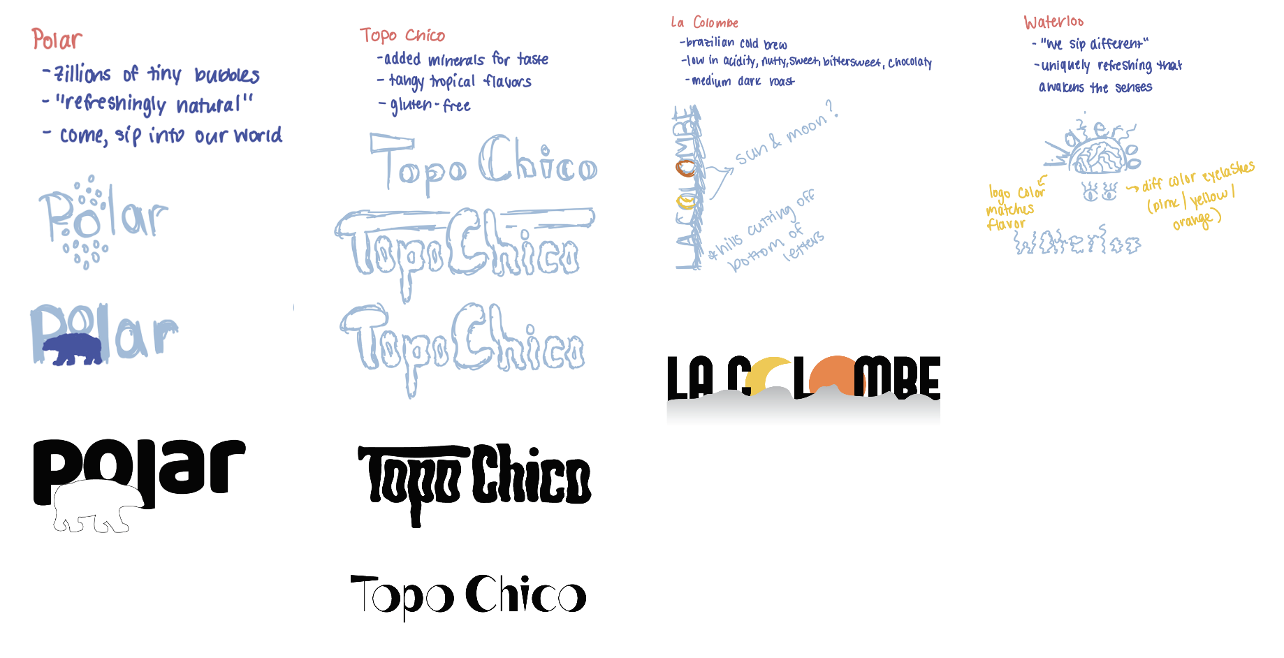
Visual Research
Sketches
DESIGN
Style
